Thursday 2 June 2016

Aldo Rossi and Alessi


In 1983 invented la conica coffee maker. This was the first coffee maker designed by Aldo Rossi. This was produced by Alessi. He had an obsession towards product related to coffee this is because he designed so many coffee makers although something in common with all the coffee makers that he invented was that they all are used for expressio.

Aldo has his own rules in design. He didn't believe in Form Follow Function. This is the most poetic projects that Rossi did. The emotion and the expression are by far the most important thing in the projects function.

Then he designed another coffee maker. In this invention, he thought more in function . La cupola espresso maker. Invented in 1988. This new invention is less expensive that the origin.

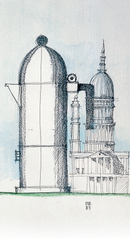
When I look at this coffee maker it reminds me of


Alessi Bird Kettle. I like the concept of this kettle.

"Even for those of us who hate getting up in the morning, it's hard not to crack a smile when you're greeted by this." That's what Brand made.tv 2015 said in a documentation.   

The Alessi bird kettle is that product that everyone wants in his kitchen because it brings  different aspects.

Alessi presented something totally different from what was the style that time of period. In that period of time, they were presenting Art Deco, Pop Art and the language of cartoons.
the Italian inventor Alessi wanted something different , something with an American feel.

The kettle bird was invented in 1985 and this was the most product sold in Alessi collection.
The concept behind the bird was 3 words Morning, wake up and coffee.  The bird had a function too. The bird has his wings wide open so your two fingers could grab on to these wings and pull off the knob without burning yourself.

"25 years later they still are making fifty thousand bird kettle a year in the same factory where it all begins. " (Brandmade.tv 2015)

The material used for this kettle is Stainless still because it's the most hygienic solid material for a kettle. Even stainless still takes a long time the get burn so if you forgot your kettle for many time without water the kettle it's not destroyed. 


The colour scheme has different symbolism like example the red indicates hot so that's where the steamed is coming out and it's dangerous to touch those parts immediately then there is the blue showing the cool. Safe to touch it and the black knob is a neutral piece.

This kettle was a hit. This kettle got us out of the norm, the usual thing to something innovative, creative and great use kettle.  

Reference.
Brandmade.TV, 2015. How the Alessi Bird Kettle is made - Brandmade.TV. [video online] Available at: < https://www.youtube.com/watch?v=3tdr0-TwcDg > [Accessed 3 Dec 2015].

Dezeen,  2014. Aldo Rossi "didn't believe that form follows function" says Alberto Alessi. [video online] Available at: < https://www.youtube.com/watch?v=VRfwaBJyi8E > [Accessed 7 Oct 2014].

Tuesday 31 May 2016

interview

 For this task, I interview an interior designer. She is Naomi Camilleri. I like her designs and even how she things in terms of design and creativity.  

The project name was ‘’SPASTACUS’’ This is a fast food pasta chain. The client had already given the project a name so she said that she was limited. She chooses to combine raw deign style which was being introduced in the US at that time and combine it with the Gladiator world of Spartacus. 

Her inspiration was the name. She said that metal was always dominant in her ideas. And she wanted to use the right style.

This project was something different. She said that raw design is in fashion right now in Malta but that time that she was doing this project it was something new. so at first the client looked confused by showing only the primary moldboards and through discussion but Then it was much clear when  she started joining things together. 

I asked her about if the material was possible to find in Malta and she said that it was a bit tough at that time, she said for the project she wanted to have partitions made out of chain maille, she found a local supplier he used to do them by hand so the cost was very high then the solution was ordering something similar from abroad since even the time frame was much shorter. Then there was the concrete flooring which she wanted metal inserts in this concrete floor but again this wasn't possible so she opts for a simple concrete floor. There were even the copper table tops she didn't find anyone who could customize them for so She  opted for rusted metal, which didn’t offer the desired effect but with the short time and also restricted budget that she had available she could do better. As she told me this I remember of Farnworth house by Mies van Der rohe's how he had a budget and didn't respect it because he wanted his design to be the best.

When I asked her this questions "Malta did evolve in the design movement?"
she answers quite straight to the point. She said  that In Malta most of the designers copy a lot either from each other or from magazines so practically its evolving by time but also for me it's not the right evolution. Like example, the Eames chair, the falling water by Frank Lloyd Wright, Farnworth house, and Barcelona pavilion by Mies van Der Rohe's and much more their design were all innovative and new that why nowadays we look after them because they inspire us and brought a new style to the world. she continues by saying that some  people choose designers based on word of mouth generally and pay good money for poorly copied design then she continue saying that  in Malta there are good designers which are underestimated.

Ms. Camilleri talked about new styles that are being introduced in Malta and reminded me of an old areas style. I liked talking to her because she is a great designer and she gave me some knowledge on what can I face in the industry of designing. 

Reference:
Naomi Camilleri, 2016. Interview on Design movement. Interviewed by Rachel Falzon. [document]  1st may 2016, 12.00.


Saturday 28 May 2016

Bauhaus


It is one of the most famous architectural buildings in the 20th century. The Bauhaus was build in only just a year. In 1926 Bauhaus was completed. This building has glass walls, right angles, and flat roofs. A 43 years old man, Walter Gropius was the architect of Bauhaus and also the  director.
Walter Gropius wanted to design a building that could be helpful to the needs of the school. He divided his building into six.
"The higher academy for the Arts"
This part of the Bauhaus. This has the large Bauhaus workshop. This is a functional area that gives every student an opportunity to express his design. As you can see it doesn't have walls just glass this is so it doesn't give an impression of enclosure. This part of building it's all about what's sees, If there are people from outside or from inside.   
Walter Gropius wanted this part to be the strongest element of the project. The image that people keep thinking of.

An area for the administrative department.
There are no extravagant wall glasses here. The students are sort of hidden a little bit.

A collective area with a theatre and a refractory.
This is where students from the technical  school. art schools and teacher meet. it's a place for performance, activities and meetings. From the facade, we see that the windows are covered. This shows that this was a private area.  

Studio accommodation for the students
This is the highest section of the building. This part is housing for students. There are 24 studio flats on four floors. As you look at this section you see the rooms enhance out onto a not so big balcony. Here there aren't big windows but there something else that is interesting. When looking at this section it's like it has a rhymed this is because it's like playing with light and shadow the element of black and white. This was a style that in that period of time architect used to do in their buildings.

Housing for the teachers


And Technical school to train young apprentices. " (csxlab, 2011)This is known as the director's office too. So Walter Gropius had to design his own office. This part had to be in the centre of the Bauhaus in a high position linking the two schools together.  The two schools are Bauhaus and the workshop and the technical school.


Walter Gropius could make it any shape he wants and he used the interlocking system by joining the 6 different buildings into and asymmetric form.

                "You must walk around the building to understand its materiality and the function of its various elements.." (Walter Gropius)

It's pointless to see the Bauhaus from one angle. The Bauhaus from every corner has different aspects.  This building has vast surfaces and different height, corresponding to the needs of the school.

Walter Gropius placed the Bauhaus in the section where there is the housing for students, when the sun raise it will hit the glass so the students will walk up early and start.

All day long the sun then falls on the workshop. Then when the sun is going to set down the technical school get the last light. The problem of the sun in summer was the heat. especially in the section of the workshop where it would be impossible to work and if they did curtains it will destroy the concept of why Gropius wanted transparency. And in the winter, there was even a problem because the steel structure will rest and it would be very cold inside. After the years, the steel structure was replaced with aluminium.  Walter Gropius came up with this brilliant idea, he created a facade bearing only its own way without any link to the floor, it's like a curtain of glass.


Walter Gropius has done something similar in his first commissions the Fagus factory.

Walter Gropius said

 "I believe that we need to lead our future architects from other observation to discovery from discovery  the invention and final urge them to use their intuition in giving artistic shape to our environment."


Reference

csxlab, 2011. The Dessau Bauhaus | 01/23. [video online] Available at: < https://www.youtube.com/watch?v=IyhrMZB-WLo > [Accessed 25 Jun 2011].

The falling water.


The falling water is known for a masterpiece. This building is voted by The American institute of architect " the most significant building in the last one hundred twenty five years. The style of the building is Organic architecture.

This building is found in laurel highland western Pennsylvania. Its surrounded by nature. The falling water building is  known for the best private house build by
Frank Lloyd Wright.


The story begins when the Edgar Kaufmann family needed a new weekend retreat in the mountains woods they loved. His design was magnificent. He placed the waterfall under the building. By the help of the Brocken edges, rocks it helps the waterfall easily and they created interesting visual features.


If you can see the falling water was thought really well in terms of the sighting. Normally architects thing in terms of putting the house facing the waterfall but that wasn't how Wright thought because he didn't care only how the building looks but also had to function well. He put the house on the waterfall because every room emits sunlight and it's something unique to view a waterfall.

The workers that worked on the constructed building was Wesley Peters a structural engineer, First on site the apprentice was Bob Mosier who begin the construction and took it to the second floor, and to the finish work on site, apprentice was Edgar Tafel. 


When Franck Lloyd Wright designed the falling water he was almost 70 years old. He was known for his brilliance ideas and even he was rejected for his wild ideas. This building has various ideas, various emotions and various materials. The thing that I really like is every season it has different aspects of the house.

 This building was built for the Edgar Kaufmann family to get away from the everyday city life and enjoy a relaxing, quiet nature house. the house is surrounded by these windows that create a panorama of plants. They are in a precise lined after each other. With the help of the framing it's giving a certain rhymed.


The construction began in spring 1936. Falling water was to make architecture history.

The stones were cut from North Korea just wast Falls. All work was done by local workers and contractor crew had to be trained by Wright ways. Many engineers when they saw the blueprint of the house they were extremely doubtful about the structure this is because they saw it impossible to place a heavy structure on the pieces of rock. But Wright has thought this well. So this was his technique he first builds a foundation and on top of the foundation, he placed another beam that stuck out above and over the foundation and on top of that beam more structure rested on it. This became the main support system for the entire building.


The material used where four type, stone which was coordinated on the corner of the site, concrete for the organic material, steel showing in the reinforcing of the concrete and included in the frames of the windows and glass. He designed the casement windows.

Frank Lloyd Wright designed as the interior furniture in a way to echo the house. All furniture has edges longer than normal furniture to give the feeling of balconies. The colours inside the house are warm  earth colours to match the exterior view.  Wright liked the colour Cherokee red and infect many pieces are that colour  includes all the metalwork that was surrounded with the entire house.
The stonewalls Wright tried to match the surrounding natural stones. The floor of the interior is stone covered with waxed.


The living room is the most beautiful part of the house. He set the layout of the house really well. The living room open the steam below to a staircase that leads to the waterfall. From the living room, you can hear the sound of the waterfall.
Over one million people have visited this site. Falling water changes people thoughts towards Frank Lloyd Wright. He made a change to architecture.


Reference:
Noy Washington, 2013. The Falling Water House. [video online] Available at: < https://www.youtube.com/watch?v=qvQZbC1OOZc > [Accessed 17 Aug 2013].


Wednesday 25 May 2016

Alvar Aalto


Aalto began his style of architecture with  a classical style and then by the time he advanced to a  Modernism and Organic Modernism. He has approximately over 500 buildings that he designed and 300 of them are build. , actually built. He didn't design just architecture but even furniture.


This building was my favorite especially the interior. This is the Essen Opera House, Das Aalto Theater that is found in Essen, West Germany. this was designed by Alvar Aalto. Alvar Aalto has won an award for the building in 1959. In this theater, they held a opera and ballet performance. This project of construction started in 1983, unfortunately, seven years after Aalto died. Although Aalto dies there were no changes in the design while constricting.

They kept following the plans of Aalto that he submitted nearly 30 years ago for the 1959 competition The characteristically of this building is the formless layout but that's what makes the building more interesting. The concept of this design was "humane architecture". 


In the interior as you can see there are the seats that are indigo blue this is to give a sense of a royal in the room. There are 1,125 seats. As you look at the interior you'll see  organically flowing basic forms that there are the balconies and the lights covering the theatre recalls Nordic landscapes. The thing that personally I really like is how the stage integrated with the whole building by its shape.


The inspiration for this building was an ancient theater in Delphi this shows the front row seats near the stage are curved and the asymmetric shape of the theater.  The outline of this theatre now it shows a similar style to postmodern. Aalto's project was the longest delay theatre in Europe.  This theatre was first opened on September 25, 1988, with a performance of  Wagner's The Meistersinger of Nurenberg. The cost of this building was 145 million Deutsch marks. Although recent changes were made ironically.  They changed the area's economy to more high-tech industries.


Something that I saw similar to Aalto design is the grand theatre designed by Zaha Hadid architects. more than the look of the building is more the curve of the balcony that I saw them really similar. even the way that the both theatres are in a shape of an oval. The two architects both have something in conmen because they both follow the same style an organic . so it's not something unusually to see same elements in their designs. 


 Reference. 

 hugenpoet,Das Aalto-Theater, the Essen Opera House
. [online] Available at: <http://www.hugenpoet.com/culture.html> [N.D]

CULTURE IN ESSEN. THE AALTO THEATRE: HOME & ARCHITECTURE
. [online] Available at: <http://www.aalto-musiktheater.de/haus-architektur/> [N.D]

 Highbrow , 2016. Alvar Aalto. [online] Available at: <http://gohighbrow.com/alvar-aalto/> [N.D]

architravel, 2015, Aalto Theater. [online] Available at: < http http://www.architravel.com/architravel/building/aalto-theater/ > [Accessed October 23 2015]

theatrecrafts, 1989. The Alvar Aalto Theatre Opens in Essen. [PDF] BY OWEN LEVY. Available
at: http://www.theatrecrafts.com/archive/cue/cue_57_25., [Accessed date JANUARY/FEBRUARY 1989  ].


De Stijl


For this style, it required visual art. In this style, they only required only primary colours (Red, Blu and yellow.) Black, white and Grey were the colours that were accepted. The lines were importuned that all of them be straight and always a right angle.

This is a few example of Destijl furniture. De Stijl  was that style that tried to invent the final design object that follows the complex an ideal of plane geometric forms. Gerrit Rietveld designed a chair called


"the Red and Blue Chair". The chair was first designed in 1918. This was one of the early  style of the current aesthetic. As you can see its made out of wood and it doesn't include variety o material. There are allot of  straight lines and angles. This chair was influenced by fine arts because as you look at it, the 1920s like an abstract sculpture made by Piet Mondrian. we see the three elements of primary colours (the blue, red and yellow on the corners)

This design wanted to give the message that something that is popular it doesn't mean it has to be complex and infect this design is simple and without the use of mechanisation. This chair had problems for acceptance. Rietveld said that normally he sold these chair to friends that who doesn't afford furniture.  in 1920s, the chair was shown in public at the exhibition in Haarlem their words were that it looked odd and funny. some people as they look at the chair they say that it doesn't look comfortable but it's the opposite around it's a comfortable piece of furniture. This chair now we see a few at museums and others are in private

As I kept looking at the chair, It reminded me of another chair. the Wassily Chair by Marcel Breuer. They look similar because of their angle. when they are seen from a side they have approximately the same form. 


influences.


This band consists of two members. These are The White Stripes and they created an album called De Stijl in 2000, which simulate the style on the cover. they used a rectangle shape Like De Stijl style, Although they didn't use all the primary colours just white, red and black. But as you look at it, it automatically reminds you of De Stijl. 


Then we have another influence of De Stijl.  Nick is reflecting Mondrian style trainers. He used the element colours of De Stile white, red, blue, yellow and black.
De Stijl style was an impact on fashion.


This collection fall-winter 1965 by Yves Saint Laurent’s. This was influenced by  De Stijl style. In these dresses, we can see the straight lines and the primary colours.


These are some models taking a shot with the influenced De Stijl dresses with the composition of  Piet Mondrian. 

Runway Collection, Prada Fall/Winter 2011 in Milan.

 This is a De Stijl swimsuit Collection by Sarah Schofield.


Milica Paradinovic-Shishalica is from Belgrade in Serbia the best hair designer. She working in Belgrade hair salons. she expresses her ideas in an artistic. She likes to be original. This was called PIET MONDRIAN. Even hair stylist are influenced in De stijl style.


In our exhibition of last year, it had an element of de style. The rectangular  grey and white steps. The element of red on the wall. Although The influence was coming from Bauhouse but it gave me the feel of De Stijl too.   


Reference:

Archdaily, 2008-2016. Review: De Stoel van Rietveld: Rietveld's Chair, book + film by Marijke Kuper &amp; Lex Reitsma. [online] Available at: < http://www.archdaily.com/151703/review-de-stoel-van-rietveld-rietvelds-chair-book-film-by-marijke-kuper-lex-reitsma> [Accessed  17 August, 2011]

shishalica, 2012-2013. Pier Mondrial . [online] Available at: < http://shishalica.com/about.html> [N.D]

Knoji, 2015 . De Stijl: Mondrian and His Influence. [online] Available at: < https://arthistory.knoji.com/de-stijl-mondrian-and-his-influence/> [N.D]

Kenney Mencher, 2012. Architecture in the Early 20th Century, Modernism, Bauhaus, DeStijl and International Style. [video online] Available at: < https://www.youtube.com/watch?v=wUb1ficeiD8 > [Accessed 16 May 2012].